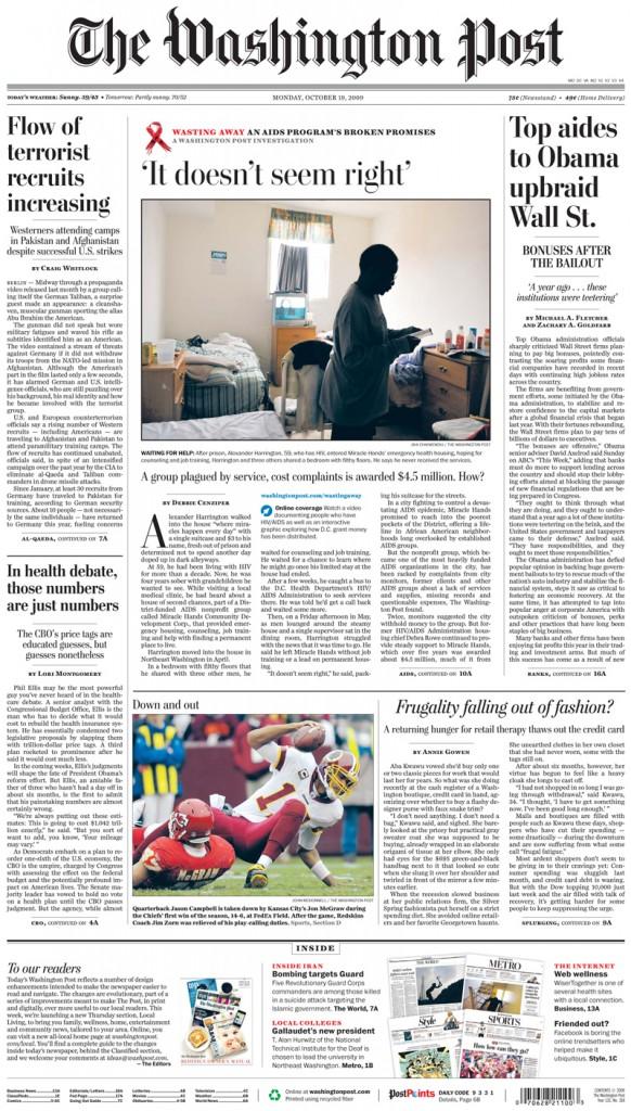
Flipping through the Washington Post in the morning, your eyes might be too sleepy to fully comprehend just how much the paper has changed. But chug some coffee and suddenly you’ll notice how the weather page is smaller and that the Reliable Source isn’t in its usual place. Aided by the caffeine boost to the brain, the larger changes, like the different body font, content spacing and random, unnecessary graphics, soon come into sharp focus.
In a feeble attempt to increase readership as well as keep current subscribers, the Washington Post recently implemented several design changes. News design director Justin Ferrell said it was important to redesign the paper to update some inconsistencies, like section organization. Ferrell adds that the Post made the changes in order to reflect current communication and media habits.
As anyone who reads the Post can say, it’s not the most “hip” newspaper. The changes to the Post do nothing to increase its readability, and instead detract from the otherwise high-quality content by making the paper overly spaced out and difficult to navigate.
In 2002, the Post also refined the paper’s layout. Most changes were mechanical, like a new font and content placement, and went largely unnoticed by the public.
But this time, the Post has unwisely done a complete turnaround, redesigning not only their print edition, but also their website and magazine.
The new layout of the magazine reads like a booklet of catchy graphics and advertisements, and does no justice to the Post’s reputation of high-profile reporting and top-notch photography. Though editor Debra Leithauser and art director Janet Michaud tried to put a positive spin on the layout changes in a recent online chat, the majority of readers offered negative feedback.
Following the complaints about the magazine, Ferrell says that the Post has gotten mixed reviews on the redesigned paper. Feedback, though, has been a great help to the Post staffers. The Post listened to its readers numerous complaints and even reinstated some old standbys. The beloved weather page has now been returned to its old sizing.
The Post’s other changes still fail to impress readers new and old.
The change in body font makes the text difficult to read. Brauchli, in a recent Q & A with freelance journalist Charles Apple, who blogs about graphic design, explained that the Post tested several fonts for readability before choosing the new font. He did note, however, that not all readers think the new typeface is easier to read. Not only does reading the paper prove to be a battle, but deciphering its funky new graphics is a new challenge altogether.
The addition of face sketches of the writers above their columns is distracting and wastes space. In some cases, head shots can add visual interest to an otherwise bland page, like in the Wall Street Journal. The Post’s attempt to use them falls short, as the drawings are awkwardly positioned and divert attention from the text.
The reformatting of the Washington Post proves to be a major letdown. The Post would be better off restoring the paper to the old layout and saving the style changes for another time, since the new one only disappoints and confuses readers. Nowadays, with papers doing everything they can to grab the reader’s attention, sometimes being traditional is the key to standing out from the rest.


Don • Nov 12, 2009 at 5:29 pm
To appreciate my earlier comment a little better, you need to think about it from the reader’s point of view. Imagine if you read an article in the Post critiquing the design of the NY Times or some other publication while ignoring the Post’s own faults. The Post would be besieged by complaints – rightfully so. Agreed, reporters aren’t responsible for the design of their own newspaper but such articles present an air of double standards and hypocrisy when a publication doesn’t hold itself up to the same scrutiny and standards by which it measures others.
So yes, I appreciated that the author of the original article wasn’t responsible for the design of the B&W. Nonetheless, authors and their editors need to be aware of how articles will be interpreted. The author should have either explained why she wasn’t looking first at her own publication or she should have started out with such a critique of the B&W and only then moved on to other publications.
At the same time, I’m surprised that a comment from the staff (signed “Black & White Staff”) in response to my comment also avoided any explanation of these issues. Clearly, if the original author is an expert on journalism design, it would make sense of the B&W to avail itself of her insights.
As long as I’ve got the ear of the staff, please address the lack of a feedback mechanism. The articles offer no way to contact their authors. (For example, where do I send corrections?) And the About page provides no way to give feedback to the editors or other writers. I see an email address for the webmaster but surely this is not appropriate for feedback to the reporters and editors, yes? If it is, your About page should explain that.
Besides sending corrections and suggestions on improving the design, another benefit of making editors easier to contact would be to hear suggestions on what the B&W should cover. There are all sorts of really good stories concerning the school that aren’t being covered. Can we submit suggestions? And if possible, make the suggestion mechanism public (like a Facebook Wall) so that other people can offer additional encouragement or insights on particular topics.
Surbhi Agrawal • Nov 12, 2009 at 12:11 pm
Don,
Thanks for your comment. We hope you are aware that the writer has no part in the online’s redesign. The writer is merely stating her opinion, just as you are stating yours.
Black & White Staff
Anonymous • Nov 12, 2009 at 11:45 am
well i thought it was a good article. don, your use of proper capitalization doesn’t scare me.
Don • Nov 10, 2009 at 7:50 pm
Is it appropriate to castigate the Post’s redesign when the B&W’s redesign has so many flaws of its own? For example, the pictures sliding back and forth on the home page is quite distracting. Don’t get me wrong – it’s better than last year’s design. But if you took the effort you put into scrutinizing the Post, you could really improve the readability of the B&W. And then articles critiquing other information sources wouldn’t come off quite so badly.